PNI, Staples Case Study
Clarity & Conversion for Printing
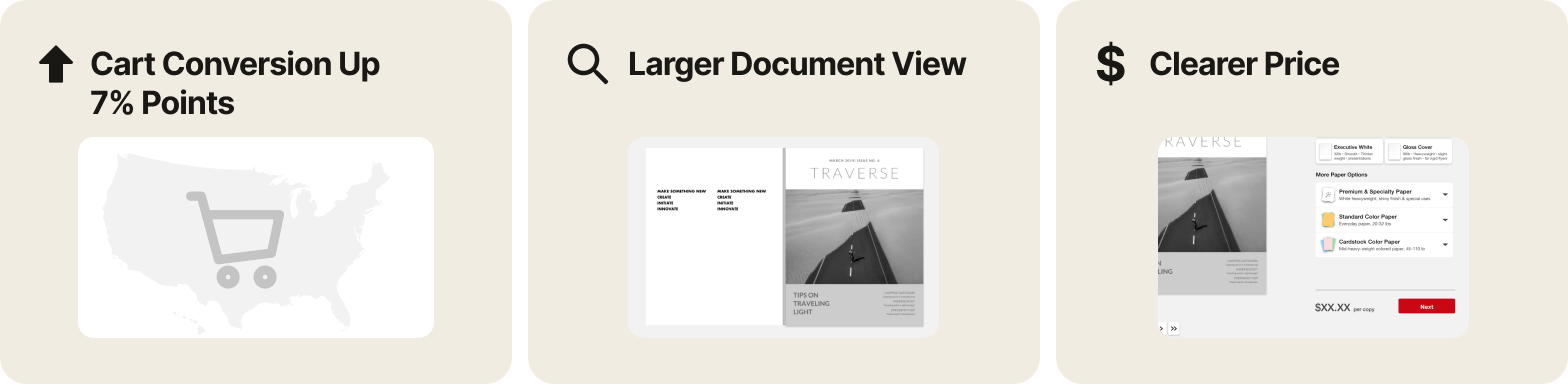
Increasing USA multi-page printing cart conversion by 7 percentage points nationwide and improving the printing experience
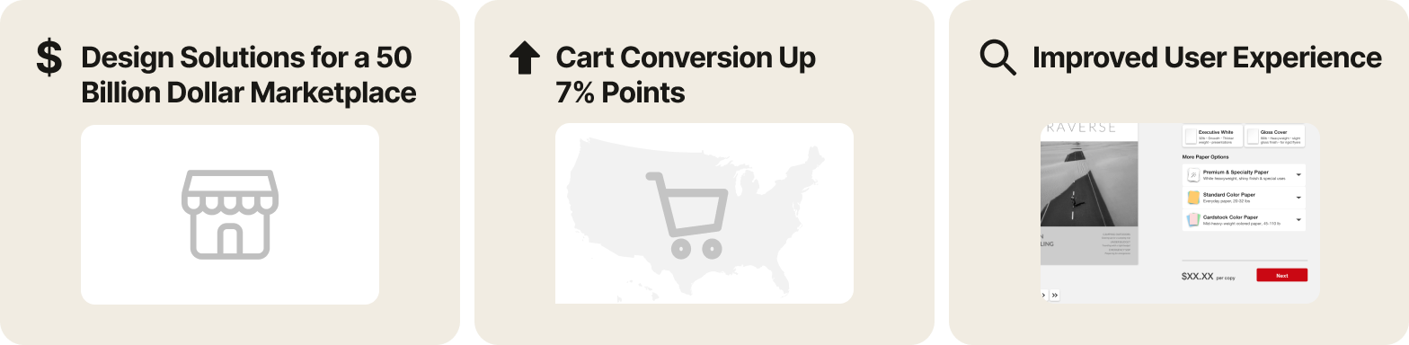
This project and others I did at PNI Media were part of the Apollo project. The Apollo project has taken the scattered end-user experience of a $50 billion marketplace and made it a simple, more engaging experience for both retailer and customers. The online printing experience was improved while helping customers achieve their goals and increasing USA multi-page printing cart conversion by 7 percentage points nationwide.
Problem Statement
Customers were dropping off in the printing flow
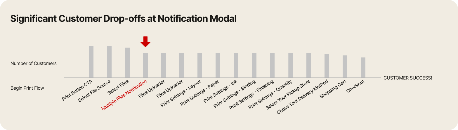
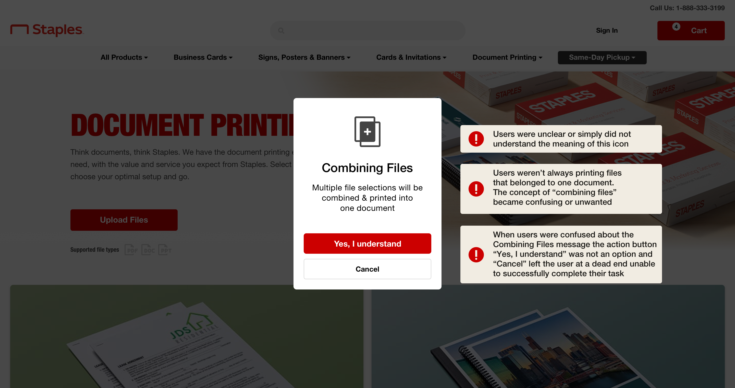
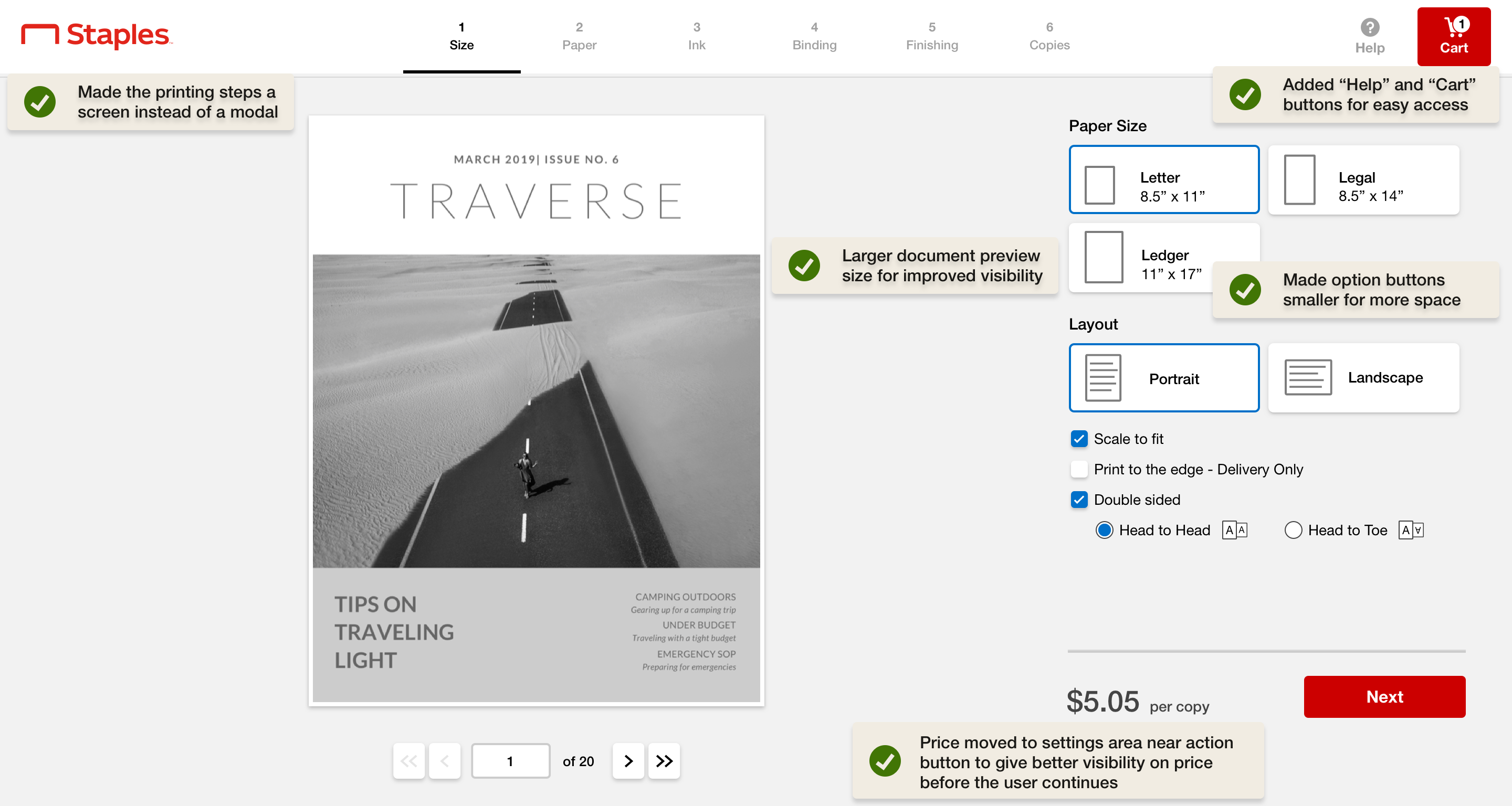
The Staples print configurator was built to allow customers to upload documents for printing. Customers wanted a clearer view of price accrued and a larger view of the uploaded document. Data showed customers were dropping out of the configurator flow at the multi-document notification modal.
Intitial User Testing and Feedback
Initial user testing went well,...unfortunately!
During the first round of user testing users didn't appear to have much trouble at the Combining Files Notification modal offering no clues as to why the step brought so many drop-offs in the the real world.
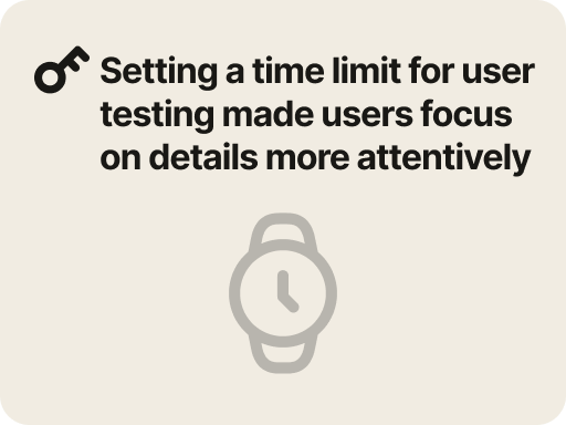
I felt the user testing condidates were being a bit too glib about owning the details of the printed documents. In order to extract more focus out of the users I decided to use the exact same testing plan and secript but to set a time limit for the next round of user testing.
This worked!
Every user that had mulitple documents struggled to clearly understand the Combining Files Notification modal, mirroring the cart flow analytics in the real world.
Iteration Results of User Testing and Feedback
Discovering why users are unclear about the "Combining Files" notification wording and icon when uploading their documents
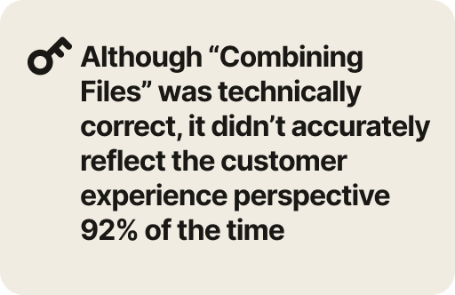
Users weren’t always printing files that belonged to one document. The concept of “combining files” became confusing or unwanted. The title, icon, text description and call to action buttons all led to a certain level of trepidation for most users.
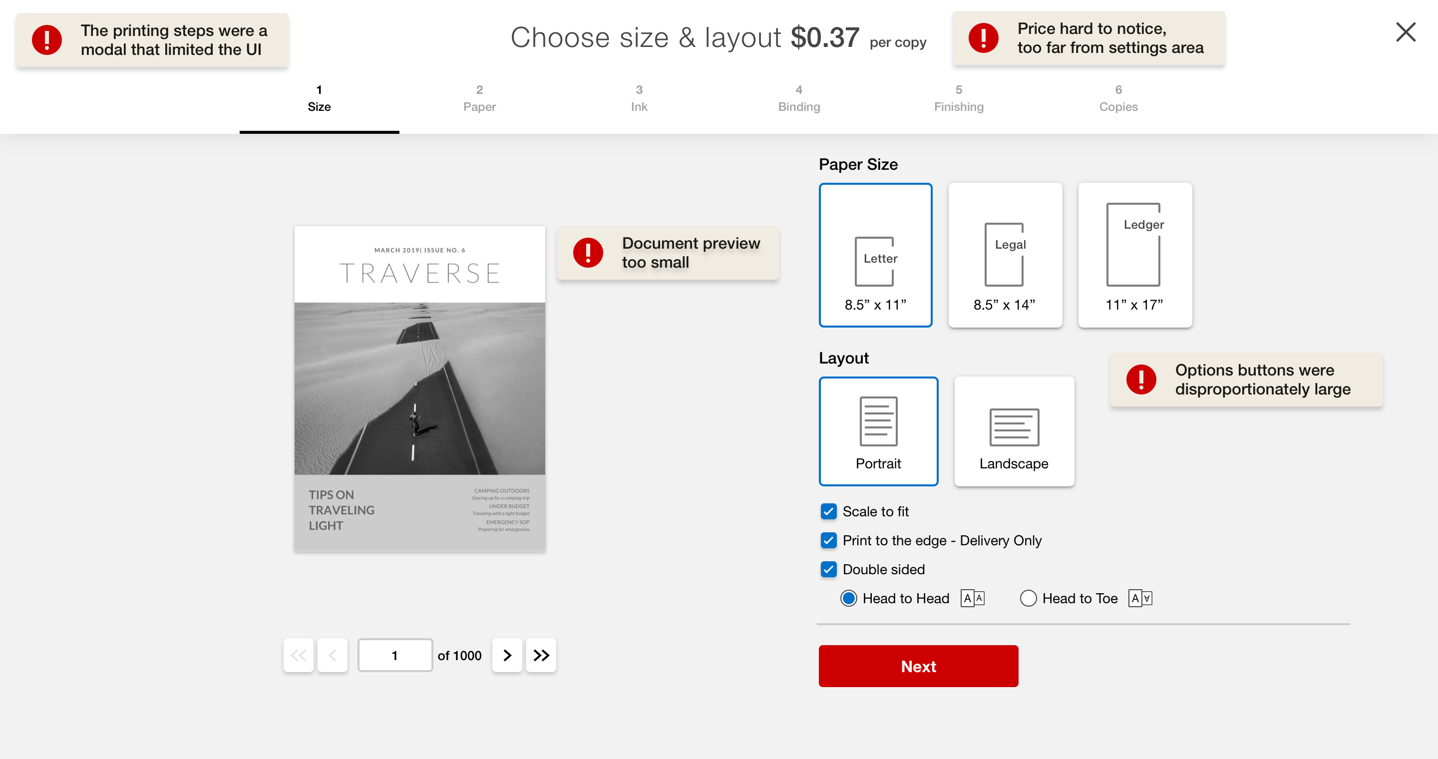
In addition users were having troubles finding the price and were wanting to see a larger view of their documents
The online printing flow sent the user to a modal. This modal covered over the home button and cart UI preventing users from having quick access to these features. Some users had trouble noticing price changes since most eye tracking data showed users focused on the printing options UI area. A significant number of users requested a larger view of their uploaded document.
Data Analysis
Only 8% of users select the binding option to combine files
I was curious how many customers needed to actually combine their files together at the binding step. It turned out only 8% of the users actually ever selected the binding option which meant most users weren't printing files that needed to be combined together. The concept of combining files was too close to the print settings step for binding pages together. It was true that in the database the individual files were being combined into one file in order to print, but the customer never sees this, nor needed to know this.
Solutions
Clarifying the messaging about print settings for mulitple files
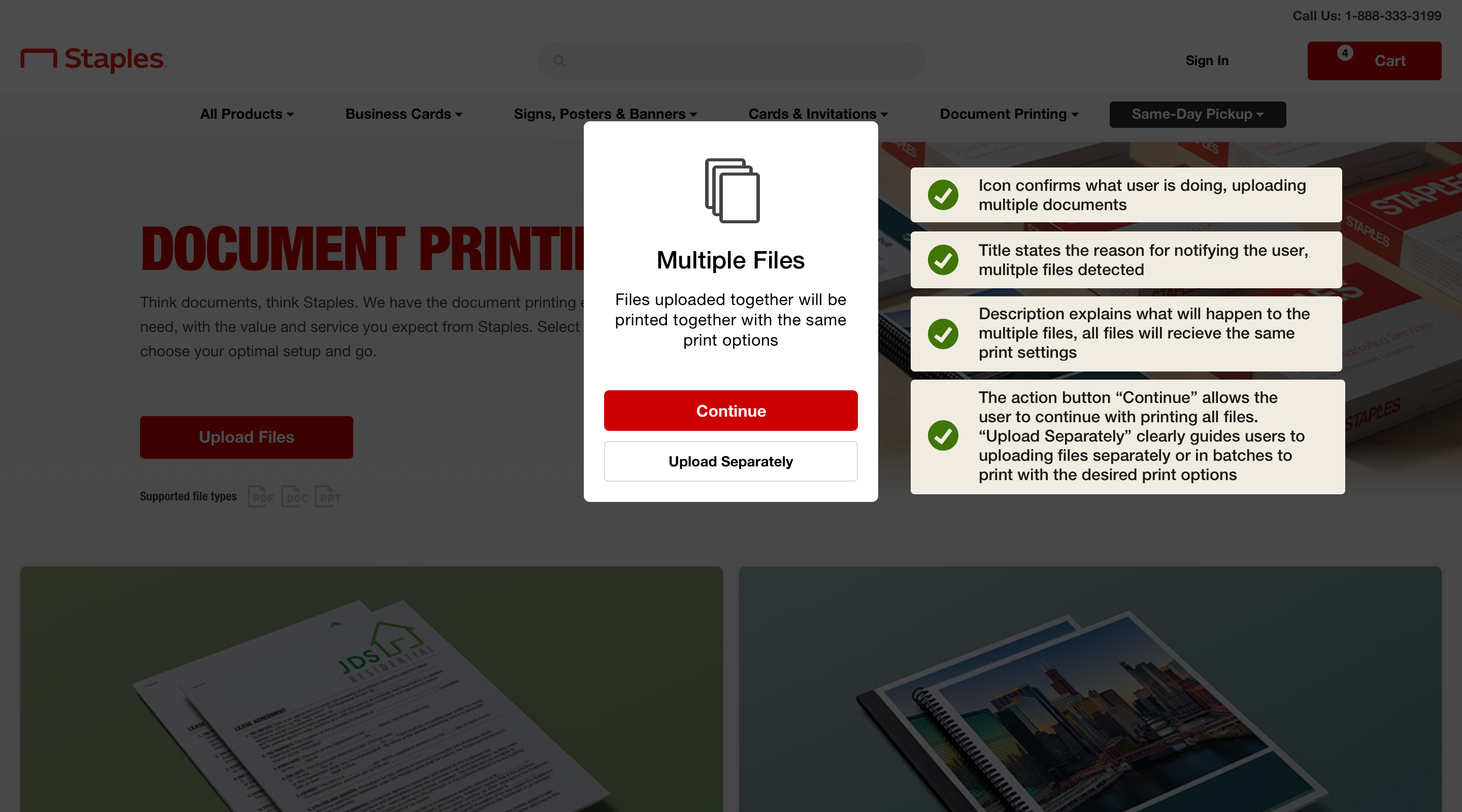
The solution was to redesign the icon, title, description text and call to action button labels. The solution worked because the Multiple Files message covered more use cases with clarity. Whether printing multiple files with the same print options or printing multiple files with different print options the users understood what would happen with their files and made the appropriate CTA choice on the modal to successfully print their files.
Redesign of the print settings layout UI to help users select options with ease and be empowered with price awareness
The new print settings page layout design allowed for more options in the header navigation, including a way back to the home page, a link to the help resources, and a view of the cart UI. The printing option buttons were made smaller to allow for space for a larger document preview. The price per page was moved close to the "Next" action button to allow users to better see the price and price changes while adjusting the printing setting, and before moving on to the next step.
User Testing and Feedback for New Designs
Users felt the new messaging and layout adjustments were easy to understand and navigate
Users felt the new messaging and layout adjustments were easy to understand and navigate. The price and the CTA together in the bottom right helped users be cognizant of the product cost as they made changes to ptint options and progressed through the steps. Adding the cart button helped users quickly exit to make a payment. Navigating in and out of the the entire printing flow was easy.
Thank you
Thank you for taking the time to read through this case study. If you have any comments or questions about the case study feel free to reach out, mp@mikepriebe.comma.ca